

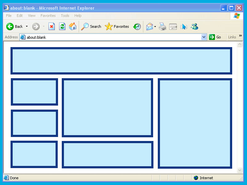
Ah, the humble HTML table. Once the crown jewel of web design, now a relic that makes modern developers roll their eyes and mutter, “Not this again.”
For those who lived through the early internet days, tables were everything.
They weren’t just for organizing data—they were the web designer’s duct tape, scaffolding, and blank canvas. Nested tables? Oh, that’s where the magic (or madness) happened.
Grab your coffee (or therapy cat); we’re diving into the wild world of tables.
A Brief History: When Tables Ruled the Web
Back in the ’90s, CSS wasn’t the stylish, responsive powerhouse it is today. Instead, web designers had one tool to bring order to the chaos of the web: tables. Need a multi-column layout? Use a table. Want pixel-perfect alignment? Add a table inside a table! Fancy a header bar? That’s right, table time.
Developers built sites like Russian nesting dolls, stuffing tables within tables within tables. It was a symphony of Sure, your HTML ended up looking like the blueprint for an IKEA bookshelf, but it worked! Mostly. Sometimes. Until you had to debug it. Ah, nested tables—a concept so notorious, it might as well come with a warning label: “Abandon hope, all ye who enter here.” Let’s say you had a simple layout idea. Easy, right? But by the time you finished nesting tables for your header, sidebar, footer, and “fun, animated GIF section,” your HTML looked like it had been possessed by a rogue AI. Forget styling; you needed a PhD in archaeology just to locate that one rogue Modern devs with their fancy flexbox and grid don’t know the struggles. Nested tables were the original escape rooms of web design. If you could debug a deeply nested table layout in under an hour, you deserved a medal—or at least a drink. Now let’s talk aesthetics. Table borders were an art form. Should you go for solid or dashed? One pixel or three? Fancy double borders? Oh, the possibilities were endless. Of course, if you wanted something truly avant-garde, you’d color each cell differently. Sure, it made your website look like a clown threw up on it, but boy, was it bold. Pro tip from 1998: if your table wasn’t working, just add The arrival of CSS was a bittersweet moment for tables. Suddenly, tables weren’t needed for layout anymore. They were unceremoniously dumped into the “data-only” corner of HTML. Flexbox and Grid swept onto the scene like rockstars, making layout design intuitive and responsive. But tables weren’t bitter. Oh no. They just quietly sat in the corner, waiting for the next poorly designed email template to drag them back into the spotlight. Don’t call it a comeback—they never left. Sure, they’re not the layout workhorse they once were, but tables are still essential for displaying data. Try using flexbox for a spreadsheet. Go ahead, we’ll wait. Tables know their worth. And nested tables? They’re like the eccentric uncle at a family reunion—rarely seen, deeply confusing, and the source of stories that will haunt you forever. Tables may not be trendy, but they’re reliable. They’ve been there for us, through Geocities and beyond. They’ve taught us patience, problem-solving, and how to cry quietly at 2 a.m. while fixing a broken layout. So, let’s pour one out for the humble table. You were the unsung hero of early web design, and for that, we’ll always respect you. Just… maybe stay away from nesting, okay?
In today’s roundup of the latest research for web designers, we’re going to look at a variety of topics, from 2020 holiday shopping predictions to missed opportunities in SEO.Retail Experts Predict Hu
If you’re a half-decent designer or a relatively competent developer, then there’s no reason you can’t make a living as a web designer. Here are six simple steps towards earning a living using the ski
Micro-interactions originated with the need to guide customers who had hit a snag while using a service or a product. The goal was to ease customers into being more product-savvy via subtle reassuranc
That starts with having the right marketing tools and resources to facilitate your design career. But it takes more than having these tools at your disposal. You also need to use them.Here are five ma
Stepping into a website that’s already well-established isn’t always easy. For starters, you have to be careful about not stepping on anyone’s toes (the client’s or even the previous designer’s) when
How can your customer reach you? If a client arrives on your website after searching on Google, what can they do to take the next step in a relationship with your brand, without buying anything?One of
“User experience” is a broad term that gets bandied around at meetings and swapped with “user interface” as if the two are the same—they’re not. This confusion has probably affected your career as UX
With web users increasingly time-strapped and suffering from information overload, there’s definitely a sense of relief when encountering a site where “less is more”, with fewer pages, fewer choices, ,
, and . Nested Tables: The Russian Doll of Nightmares
that was causing your layout to implode. The Art of Table Borders
border="1". It didn’t solve anything, but at least you could see the chaos you created.Tables vs. CSS: The Great Breakup
Tables Today: The Comeback Kid
In Conclusion: A Love Letter to Tables
You May Like

Latest Research for Web Designers

6 Simple Steps to a Career in Web Design

Using Micro-Interactions to Drive UX
5 Marketing Tools Every Designer Needs
How to Tackle a Redesign
How to Design a Contact Page that Drives Engagement

12 UX rules every designer should know

Keeping UX simple with anticipatory design
Leave a Comment
We'd love to hear your thoughts on this article